Virgin Wines
Collaborative Industry Project - UI & UX
UI, UX, Prototyping & Testing
Having recently undergone a fresh, bold new rebrand, we were briefed by Virgin Wines to redesign their existing checkout, about us and wine tastings web pages, applying their new identity and refreshing the UI & UX.
The collaborative group project required both desktop and mobile designs, with consideration for the business element of the project - any changes that could increase conversion rates would be beneficial.
The Brief
With a fresh, bold new rebrand, we were tasked with redesigning Virgin Wines’ checkout flow, from sign in & account creation to order confirmation, their newly renamed Wine Tastings page (previously live events), and their about page.
Both mobile and desktop designs were needed, as each was equally important - although 70% of visits come from mobile devices, 55% of purchases are made on desktop.
The Research
We began our research with a user journey map of the existing site, for the flows from the homepage to each of the three pages we were to redesign.
We identified areas where the journey was inefficient and could be streamlined, such as the live events page and checkout flow, simplifying the user experience. This helped to give focus to our designs later.
Competitor Analysis
Through looking at other subscription orientated services similar to Virgin Wines, we identified design patterns to consider incorporating or potentially avoiding. This helped to diversify our design research in areas we might not have initially considered and better understand interfaces users may already be familiar with.
We each looked at one direct and one indirect service - one of these was Majestic Wines, a direct competitor. I identified they had much more simplified, streamlined checkout experience, which handled delivery details in a clear and organised layout.
Heuristic Evaluation
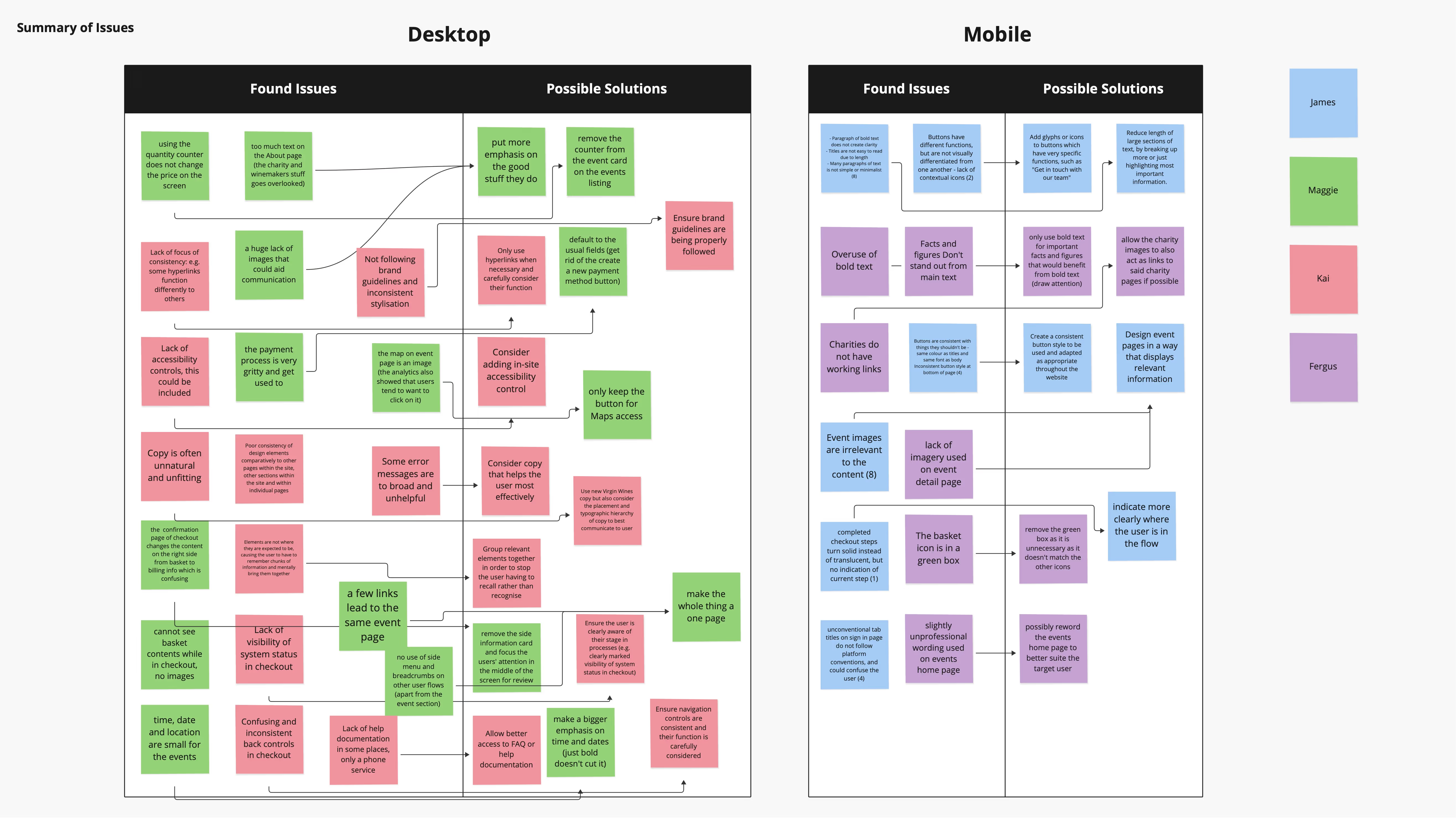
To clarify the most important areas of each page to improve, we categorised issues found according to Jakob’s Ten Usability Heuristics. Some of our key findings included:
inconsistent styling of text, buttons, links & icons
copy supported by either irrelevant or a lack of images, in some cases
it was unclear where the user is in checkout process, as the current design doesn’t clearly show which step the user is on, and which are complete
unconventional microcopy, such as ‘I’m back for more’ referring to ‘sign in’, potentially confusing users that are searching for a familiar phrase
Design Research
Alongside developing wireframes and low fidelity designs, I completed a range of design research looking into websites in all kinds of industries and how they design and structure about pages, checkout flows and event booking experiences.
From this, we identified common, successful design patterns that we could consider in our redesign - such as card-based layouts, storytelling-based approaches to presenting in depth information, and engaging visual elements relating to details about upcoming live events and experiences.
The Redesign
Checkout
Our redesigned checkout experience organises information in a card style layout, helping to focus the user’s attention and create separation and clarity between input fields and the page background.
Primary buttons utilise the bold and bright Virgin red in moderation, to maintain its impact and the sense of quality associated with the brand.
The use of an official Virgin darker red background gradient on the account sign in and creation screens conveys a sense of formality and introduction, whilst lighter, airier and more subtle colours behind the delivery and payment information cards direct the user’s focus to completing the process.
Wine Tastings
A distinct aspect of Virgin Wines’ Wine Tasting events is the fun, relaxed nature of the event - a point they wanted to bring attention to in a redesigned tastings page. Our design focuses on initially highlighting what to expect when experiencing a wine tasting, introducing users to the unique Virgin way of trying different wines.
The design then prioritises showing the user the soonest upcoming wine tastings, encouraging a minimal time delay between learning about the event, forming an opinion and booking a ticket. Further down the page, additional information such as FAQs, travel information and Ts&Cs are presented to preemptively answer any queries or hesitations users might have.
About Us
Our redesigned about us page greets the user in a direct, personal tone with a phrase that creates a feeling of inclusion. The new design is a horizontally scrolling experience, designed to tell the story of the company and deliver an immersive brand experience. To aid this experience, a simplified navigation header replaces the standard menu and draws the user’s attention to the bold page design.
The experience is split into three segments, derived from the content of the about page, and naturally help the page be more digestible to users. Typically, about pages can be too text, statistic and information heavy - an issue this experience solves.
Playful animations connect the three segments, visualising some core aspects of the brand.
Presentation & Project Summary
At the end of the project, we presented our redesigns to the Virgin Wines team at their Norwich offices. The presentation was a valuable experience, and we received positive feedback about our ideas design choices.
I’m pleased with the outcome of the project, and the quality of the UI work I did on the checkout especially. Designing a complex flow for both mobile and desktop which was being user tested whilst I was still working on parts was a new and challenging experience, and required me to stay organised and use components, variables and styles efficiently to enable quick changes and consistency across frames - and the file as a whole.